
The best fonts for subtitlesLas mejores tipografías para subtítulos
A subtitle has a harder job than almost any other type on screen. It sits on top of moving footage, it has to survive a bright background it cannot control, it is read on a phone held at arm's length, and it is gone in under two seconds.Un subtítulo tiene un trabajo más difícil que casi cualquier otro texto en pantalla. Está encima de imagen en movimiento, tiene que sobrevivir a un fondo brillante que no controla, se lee en un teléfono a distancia de brazo, y desaparece en menos de dos segundos.
That job decides the answer. The best subtitle font is not the prettiest one — it is the one that stays legible under all of those conditions at once.Ese trabajo define la respuesta. La mejor tipografía para subtítulos no es la más linda — es la que se sigue leyendo bajo todas esas condiciones a la vez.
Weight matters more than the typefaceEl peso importa más que la tipografía
If you change one thing, change the weight. A bold or black cut of an ordinary sans will outperform a beautiful typeface set in regular, every time, because thin strokes disappear against busy footage.Si cambiás una sola cosa, cambiá el peso. Una sans común en bold o black le gana a una tipografía hermosa en regular, siempre, porque los trazos finos desaparecen contra imagen cargada.
This is also why so many creators land on the same handful of faces without coordinating: Impact, Bebas Neue, Montserrat Bold, and heavy grotesques generally. They are not fashionable choices, they are survivable ones.También por eso tantos creadores terminan en el mismo puñado de tipografías sin ponerse de acuerdo: Impact, Bebas Neue, Montserrat Bold y grotescas pesadas en general. No son elecciones de moda, son elecciones que sobreviven.
An outline is not decorationEl contorno no es decoración
White text on a white wall is invisible, and you do not always control what is behind you. A black stroke around the letters, or a solid marker-style highlight behind them, is what makes a caption independent of the footage.Texto blanco sobre una pared blanca es invisible, y no siempre controlás lo que tenés atrás. Un contorno negro alrededor de las letras, o un resaltado sólido tipo marcador detrás, es lo que hace que el subtítulo sea independiente de la imagen.
This is the single most common mistake in homemade captions: perfect font, no outline, unreadable the moment the subject walks past a window.Este es el error más común en subtítulos caseros: tipografía perfecta, sin contorno, ilegible apenas la persona pasa delante de una ventana.
Condensed buys you room, caps cost you speedLas condensadas te dan lugar, las mayúsculas te cuestan velocidad
A condensed face fits more words on one line without shrinking them, which is why it is the default for anything with long words — Spanish and German especially.Una condensada mete más palabras en una línea sin achicarlas, y por eso es la opción por defecto para todo lo que tiene palabras largas — español y alemán sobre todo.
ALL CAPS looks confident and is genuinely good for short bursts of two or three words. For full sentences it is slower to read, because we recognise lowercase words partly by their shape and caps flattens every word into the same rectangle. Use caps for punches, sentence case for explanations.LAS MAYÚSCULAS se ven seguras y funcionan de verdad para golpes de dos o tres palabras. Para frases completas se leen más lento, porque reconocemos las palabras en minúscula en parte por su forma y las mayúsculas aplanan todo en el mismo rectángulo. Mayúsculas para los golpes, minúsculas para las explicaciones.
What to avoidQué evitar
- Light and thin weights of anything — they vanish over footage.Pesos light y thin de cualquier tipografía — desaparecen sobre la imagen.
- High-contrast serifs like Didot or Bodoni, where the thin strokes break up at small sizes. Beautiful on a poster, gone on a phone.Serifs de alto contraste como Didot o Bodoni, donde los trazos finos se cortan en tamaños chicos. Hermosas en un afiche, invisibles en un teléfono.
- Script and handwriting faces for anything longer than three words.Manuscritas y script para algo más largo que tres palabras.
- Pure white with no outline or shadow, unless your background is genuinely dark and stays that way.Blanco puro sin contorno ni sombra, salvo que tu fondo sea genuinamente oscuro y se mantenga así.
- More than one font in the same video. Pick one and let it become the thing people recognise.Más de una tipografía en el mismo video. Elegí una y dejá que se vuelva lo que la gente reconoce.
How to do it in CharlatanCómo hacerlo en Charlatan
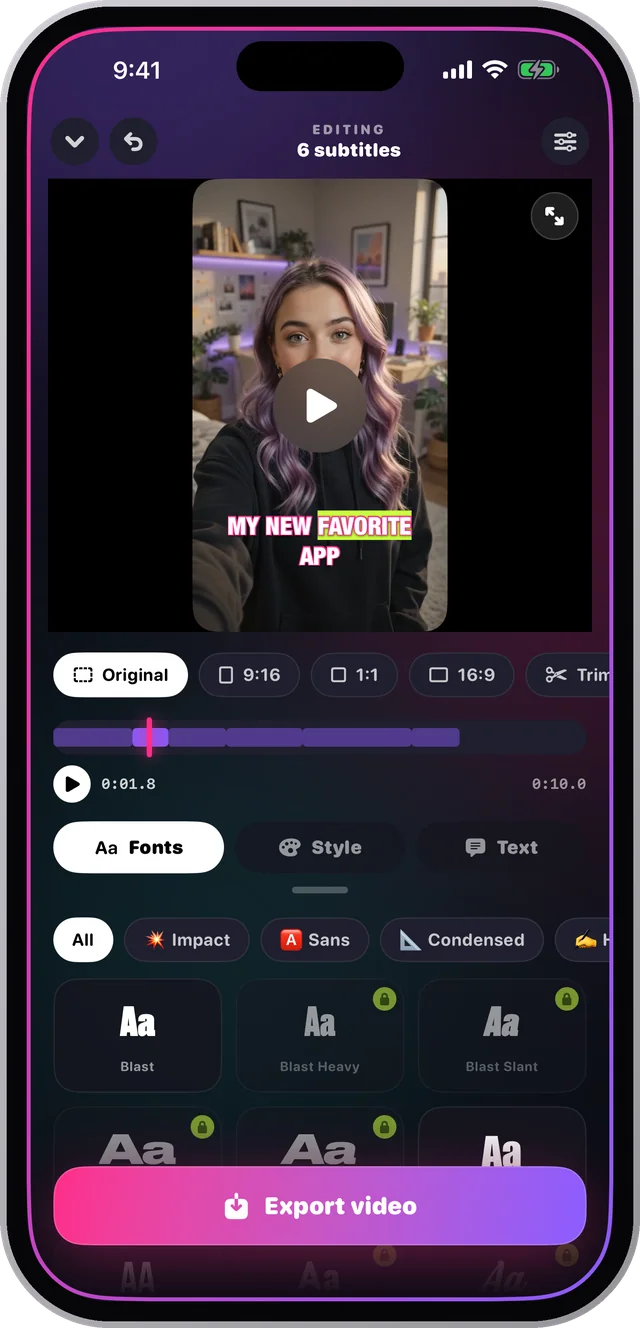
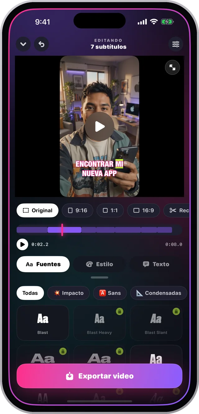
- Open your video in Charlatan and tap Fonts. The 78 typefaces are grouped by the job they do — Impact, Sans, Condensed, and so on.Abrí tu video en Charlatan y tocá Fuentes. Las 78 tipografías están agrupadas por el trabajo que hacen — Impact, Sans, Condensadas, y así.
- Tap through them with the video visible. Each one renders on your own footage, which is the only test that matters.Pasá por ellas con el video a la vista. Cada una se dibuja sobre tu propio material, que es la única prueba que importa.
- Switch to Style and turn on the outline, or the marker highlight if your background is busy.Pasá a Estilo y activá el contorno, o el resaltado tipo marcador si tu fondo está cargado.
- Try ALL CAPS with the Punch pace, and sentence case with the Phrase pace, to feel the difference the section above describes.Probá MAYÚSCULAS con el ritmo Punch, y minúsculas con el ritmo Frase, para sentir la diferencia que describe la sección de arriba.
- Save the combination as a style. It will be one tap on every video after this, which is how a channel starts looking like one channel.Guardá la combinación como estilo. De acá en adelante es un toque en cada video, que es como un canal empieza a parecer un solo canal.
Questions people also askLo que también preguntan
What font does Netflix use for subtitles?¿Qué tipografía usa Netflix para los subtítulos?
Netflix specifies a small set of clean sans faces, and the point is not the name — it is that they are medium-to-bold weights with a drop shadow, sized generously. The principle transfers: heavy enough to survive the image, with something behind it for contrast.Netflix especifica un set chico de sans limpias, y el punto no es el nombre — es que son pesos medium a bold con sombra, en tamaño generoso. El principio se traslada: suficientemente pesada para sobrevivir a la imagen, con algo atrás que dé contraste.
Should subtitles be in all caps?¿Los subtítulos van en mayúsculas?
For two or three word bursts, yes — it reads fast and looks deliberate. For full sentences, no: lowercase is measurably quicker to read because word shapes help recognition, and caps removes them.Para golpes de dos o tres palabras, sí — se lee rápido y se ve deliberado. Para frases completas, no: la minúscula se lee más rápido porque la forma de la palabra ayuda al reconocimiento, y las mayúsculas la borran.